Latest News
Latest News

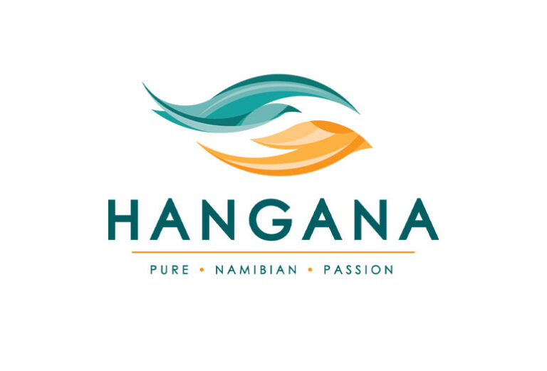
After more than a decade, Hangana Seafood, subsidiary of the Ohlthaver & List (O&L) Group, proudly launched their new logo. The motivation behind the change was the company’s commitment to ongoing innovation which falls in line with the Group’s Vision 2025 Breakthrough Strategy. By diversifying the company’s portfolio, it is only fitting that Hangana owns this new look. New ventures such as the Fish Shop, Hangana Abalone, storage facilities, berthing & launching services as well as owning a growing presence in the Southern African market reflect the company’s continuous evolution.
Rich in symbolism, the basic structure of the design is made up of three main forms as set out below. Being in the business of seafood, fish are central to the company’s identity. The symbol of a fish also takes on the meaning of life and sustenance. A symbol of hands signifies Hangana’s unique location where land and sea meet in harmony. The hands also illustrate the care and collaboration that go into creating the company’s products, and their culture of caring for one another. The final form is that of an eye, representative of having an eye on the future. It reflects the company’s foresight and dedication to forward-thinking, innovation, and a sustainable future.
The logo’s colours correspond to the Namibian landscape with shades of turquoise representing the Atlantic Ocean, freshness and the company’s ocean produce. In contrast, shades of orange are derived from the Namibian dunes and sun.
In addition to these features, as the design revolves, it takes on new meaning as it embraces each of the four elements: earth, fire, air and water. At its original angle, the logo illustrates the fluid lines and shapes of the Namib Desert, specifically where earth meets water. Being a company based on land and at sea, the logo also reflects Hangana’s diverse business portfolio. Here the dominant element of earth takes on the meaning of fertility and stability.
After a rotation 90-degrees clockwise, the design takes on the appearance of flames. This visual representation of fire is illustrative of the company’s passion and dynamism.
Flipped on its head, the design transforms into the flowing air currents above the ocean waters. Air’s qualities of flow and circulation symbolise a cleansing power as well as communication, forward-thinking and the passage of knowledge in the company.
From there, another 90-degree rotation sees the logo take on the shape of a water drop, another nod to the Atlantic Ocean as well as a focus on sustainability. In this instance, the element of water denotes life, regeneration and strength.

Lastly, the logo’s tagline consists of three words which encapsulate the essence of Hangana. Pure relates to the fresh ocean produce the company processes and packages, along with it being sustainably harvested and selected according to the highest quality standards. Namibian celebrates the company’s heritage and pride in its locally made range of products that are as unique as their country of origin. Finally, Passion speaks of the driving force behind the company’s pursuit of quality and sustainable practices, and the love their people have for their country.